Building self-service foundations for a complex SaaS platform
How do you move a support-heavy product to self-service without disrupting the customers already using it?
| Timeline | 2026–Present |
|---|---|
| My Role | Product design, UX strategy, System design |
| Area | Enterprise SaaS, Self-service admin, Platform modernization |
| Tech | Figma, .NET, Svelte, TypeScript |
Context
ClarityRFID had grown around implementation-heavy customer environments. By 2026, that model was starting to break down. The company needed a platform that could onboard faster, support multi-tenant deployments, and let customers and internal operators manage more of the system without routing routine changes through Tech Ops or Engineering.
I led product design for this initiative while helping define system architecture with an aim to unlock software that behaved more like a SaaS product and less like a services business.
Challenge
ClarityRFID sold software, but too much of the operating model still behaved like a services business. Common changes were slower and more expensive than they should have been. Onboarding depended on internal, manual processes. Customers could see some parts of the system in the web platform, but they couldn't manage it directly.
This was more than a UI or tooling gap. Configuration had to work across uneven legacy setups and support multiple scopes. Permissions, auditability, and migration all needed to be considered. At the same time, the work also had to fit inside a lean post-acquisition environment, with several adjacent platform efforts depending on the same foundations.
Approach
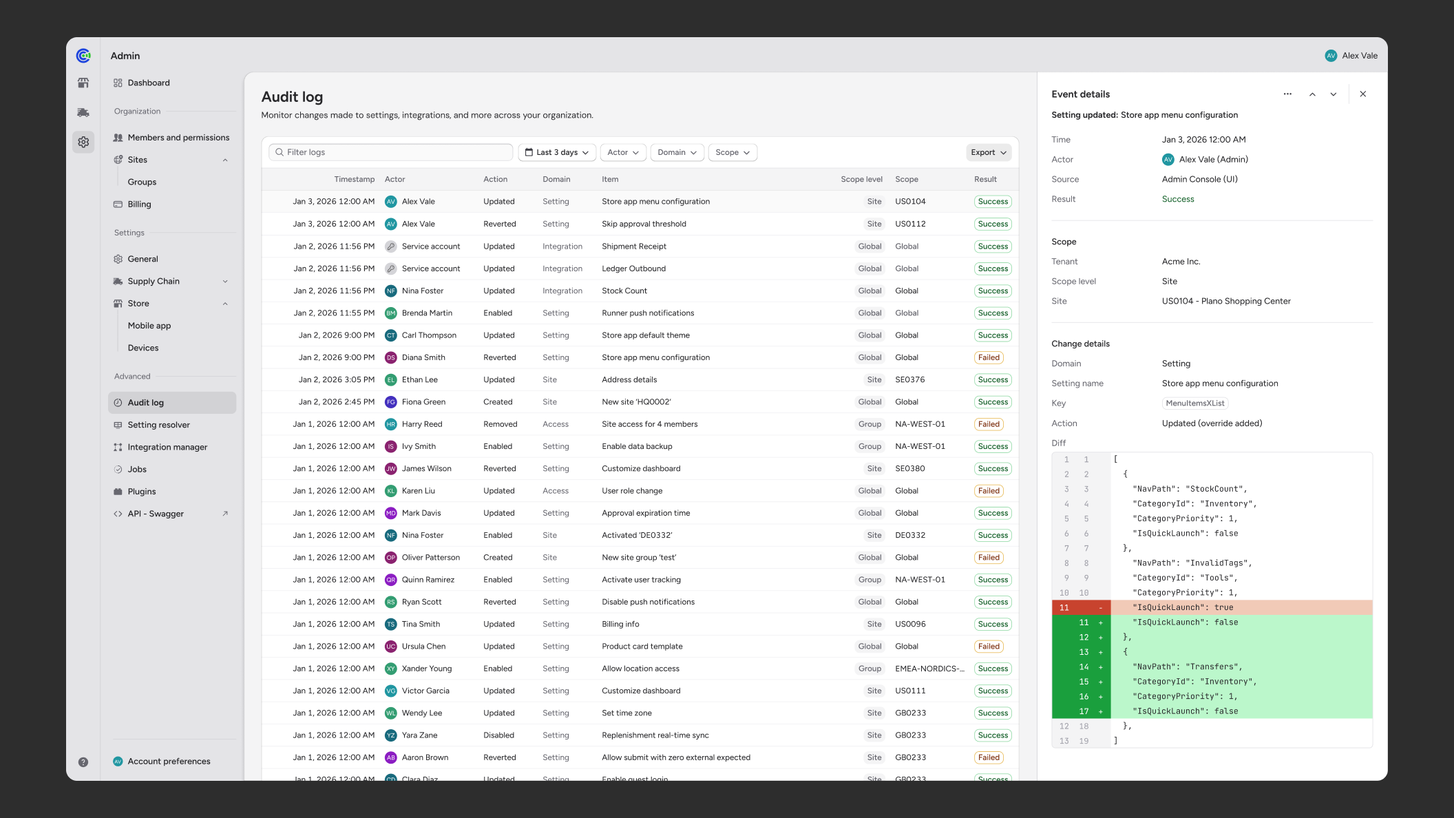
I started by workshopping with Tech Ops and internal stakeholders to map what “self-service” actually meant in practice. People used the term to describe many different needs. One was making common configuration changes safely and efficiently. Another was understanding the health of various systems and integrations. More general needs included gaps in administrative control over core data and workflows. These distinctions became the main drivers of the design approach.
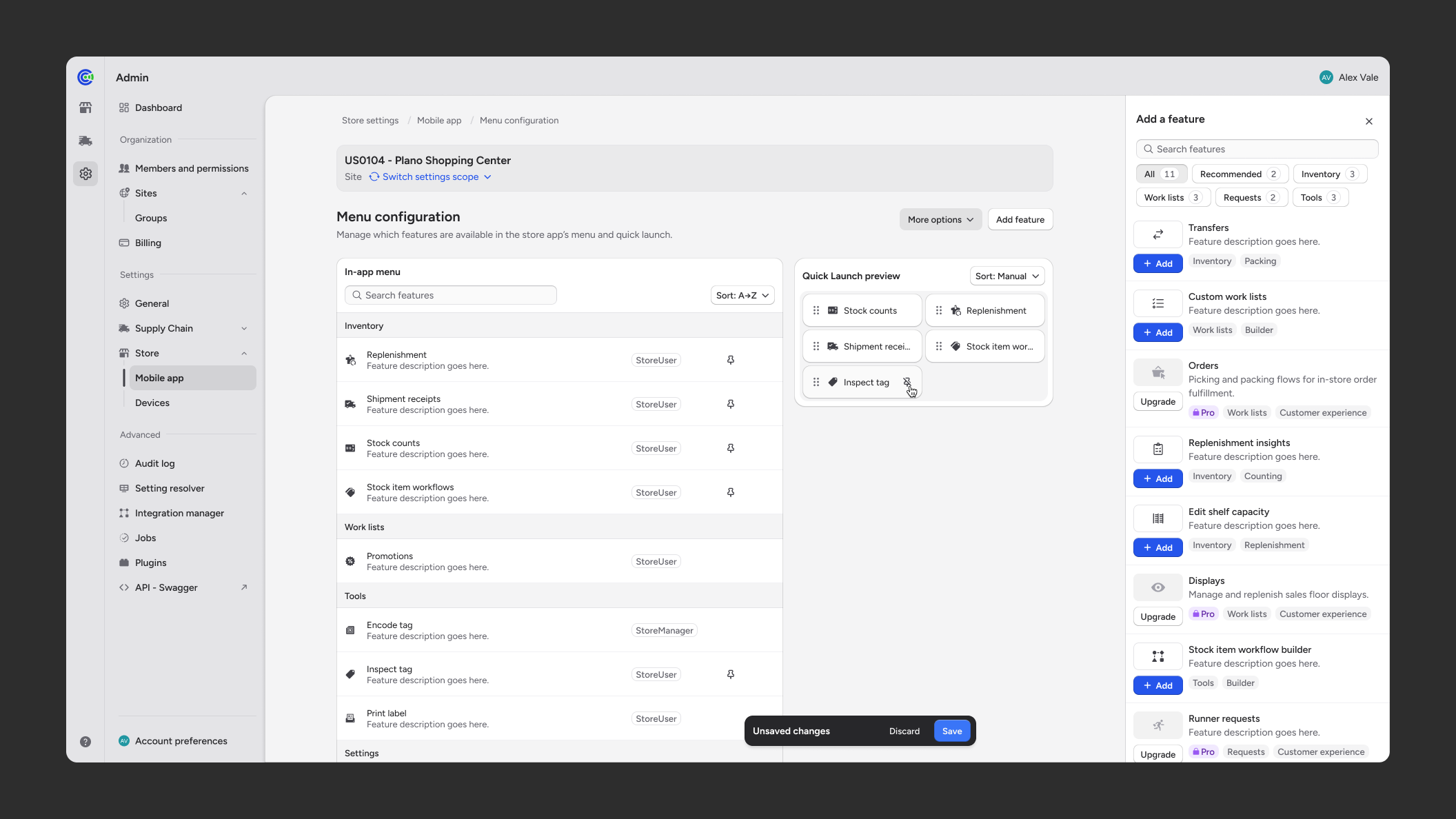
Moving toward real self-service meant making the web platform feel more like an application: a place where users could manage and reason about key parts of the system without depending on internal teams or APIs.
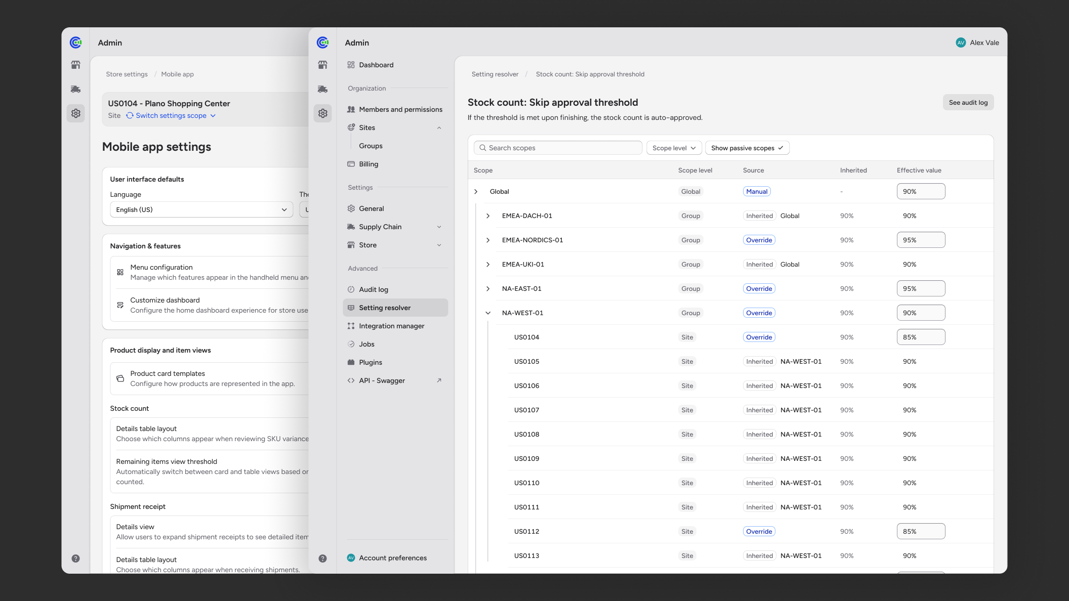
Another key insight was that some users needed a straightforward way to make common changes, while others needed to understand how configuration resolved across multiple scopes and layers of overrides.
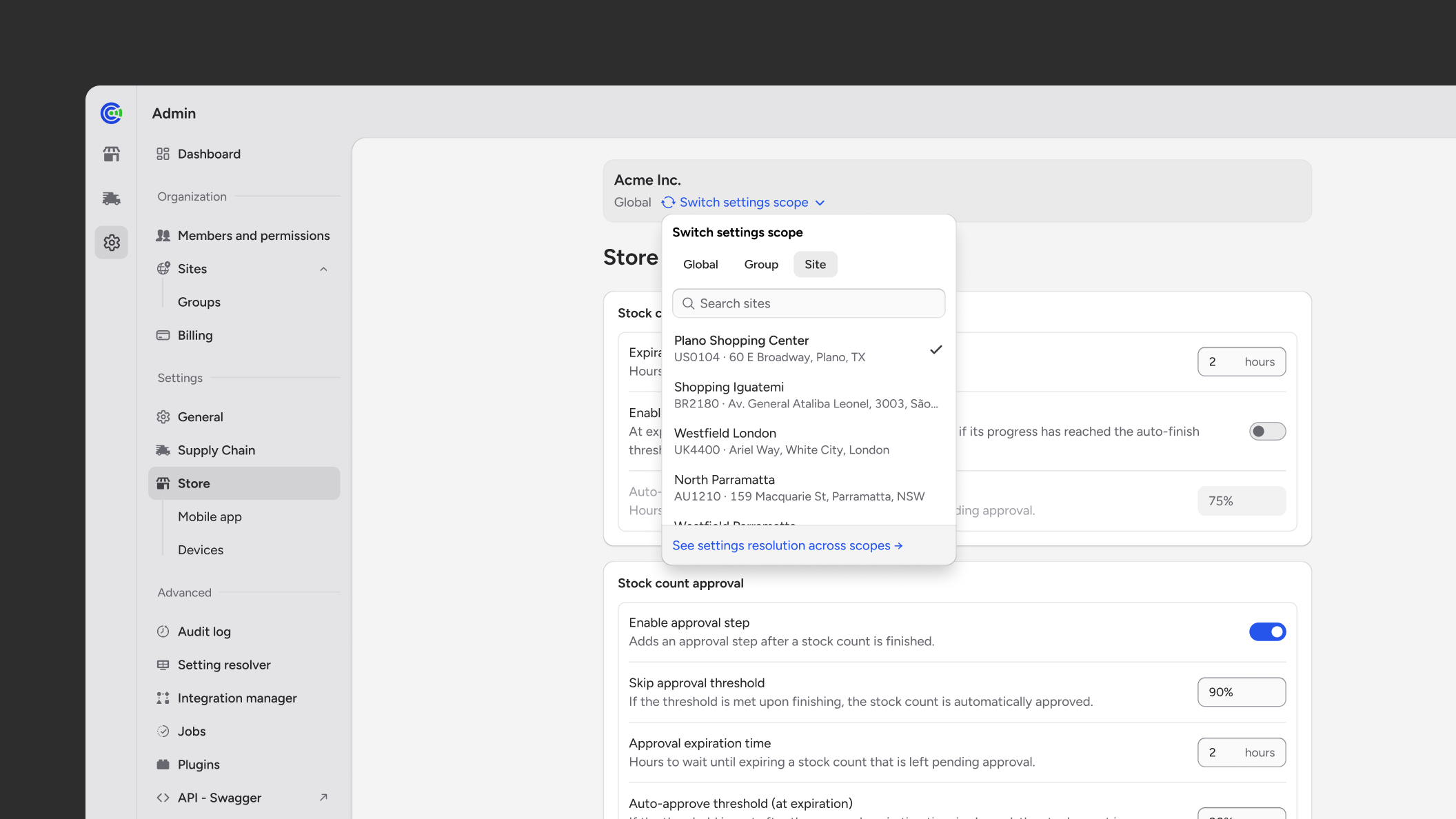
I did not try to force both into a single interface. I designed an approachable settings experience for routine work, centered on clear scopes and safe changes. In parallel, I designed a resolution view for more technical users, focused on provenance, overrides, and how effective values are derived.
This split became a central product decision. It kept the common path usable without hiding the complexity expert users needed to reason about. It also gave the team a clearer definition of various levels of complexity to build toward.
Execution
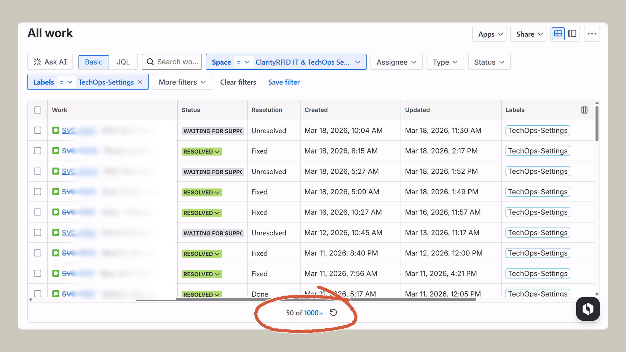
We did a phased rollout instead of trying to make every legacy behavior customer-configurable from day one. The first phase focused on Tech Ops workflows: high-frequency settings, users and roles, audit trails, and repetitive configuration work that was already creating manual overhead. The goal was to validate the model with expert internal users before expanding to customers.
Outcome
I defined the product foundation for a more interactive admin platform: scoped configuration, resolution patterns, audit history, role management, and integration-oriented workflows. This created a structure the company can migrate toward incrementally.
The same foundation also supports adjacent platform work in multi-tenancy, analytics, and a unified platform experience. It established a product model that can scale.
Reflection
My biggest takeaway so far is that self-service is not the same thing as exposing controls. In a complex system, the real work is deciding what kind of control should exist, who it is for, and how much complexity the interface should carry depending on the user’s needs.